 |
 |
 |
| Home | More Articles | Join as a Member! | Post Your Job - Free! | All Translation Agencies |
|
|||||||
|
|
Creating a New Language for Nutrition: McDonald’s Universal Icons for 109 countries. Part 2.By Maxwell Hoffmann, mhoffmann[at]translate.com
See also:
We present to you part two of a 2 part case study about the McDonald’s Corporation’s development of universal icons. As an ever-developing industry, most of us think about the language barriers everyday, but few of us deal with the concept of icons. Develop-ing pictures that are meaningful in over 100 countries and have no hidden meanings is a tricky task. In this case study we will see how McDonald’s develops pack-aging icons with the help of a linguistic iconographer and the challenges they met along the way.
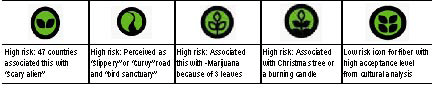
Once feedback came in from the linguists, EN-LASO project managers went into action to track and manage mammoth amounts of data. Because the data were a collection of unique responses, there was no way to "automatically" sort or tabu-late data. "This project was different from typical localization projects in that you must be sensitive to feedback on visuals instead of specific types of written data," relates David Dunn, ENLASO proj-ect manager. Typical localization projects, even for highly visual web sites or software user inter-faces, involve lots of text. "No grammar, syntax or sentence structure was involved in this project," adds Dunn. The ENLASO team collated responses, and dis-tilled all the comments into executive summaries to reduce the time McDonald’s team members had to spend reviewing all the data. This was no easy task, as David Dunn relates: "When all the spreadsheets were in, we went icon by icon over all 109 surveys. This was a very manual process," he continues. "In some sense, it resembled a customer satisfaction survey that lacked nu-meric data subject to automatic collation. Because eachwritten reaction varied so tremendously, each one had to be looked at individually." "We had to review each and every response, and grade reactions on three levels: low risk, moderate risk or high risk," Dunn continues. Although negative political or re-ligious reactions would place an icon into "high risk," so could other factors. "If a visual was strongly associated with something dramatically distant from food," says McDonald’s Lisa Wolfe, "for instance, an ‘alien,’ that would also constitute high risk of the icon being ineffec-tive." Examples of some "high risk" visuals for fiber are compared with a later, low risk visual below:
Dunn and other ENLASO team members maintain that they did not inject any of their own value judgments in feedback. "You have to allow yourself to be surprised by how other cultures perceive what you may feel is a logical image," says Dunn. "For instance, one of the early visuals was a ‘weight’ used to signify iron. Although it seemed logical to me (and no doubt the designer), the reactions were almost universally negative."
THE ROLE OF COLOR The unanticipated interpretations that color added to the picture also had to be considered. "Red signals danger or caution in many cultures," says Wolfe. David Dunn adds, "I was surprised to learn how universally the combination of black images on a yellow background is associated with traffic signs. I didn’t realize there was that much commonality across cultures for certain col-ors." The example below illustrates problems encoun-tered when using yellow and black with simple, abstract images for a proposed sugar icon:
Alastair Fairgrieve was intrigued by some of the cul-tural feedback ENLASO found on color. "We found that red is associated with ‘caution’ or ‘warning’ in numerous cultures," Fairgrieve observed, "but the scientific advi-sors in Europe recommended using red for protein be-cause that is the color for protein in some Food Pyramids. We tried to stay as close as possible to the agreed upon standards from nutritionists." McDonald’s doesn’t plan to use the individual images by themselves for this reason. "When you present the visuals for the five key nutrients together in full color," Fairgrieve concludes, "the poten-tially negative connotations of red fade away." SOME BONES TO PICK: REFINING AN ICON’S IMAGE The design and evaluation phase for most of the five primary nutrient visuals went fairly smoothly. Some of the supplemental nutrients proved to be more trouble-some. Although the designers used what they perceived as logical associations for the initial image designs, there were many surprises. A good example was the effort in defining an image for calcium. A "bone" seemed a logi-cal association to most Westerners, but it had negative and sometimes insulting connotations in other cultures. A smile for teeth was also a mystery to some countries. Milk containers (cartons and bottles) were not recognized in many Asian cultures, and sometimes were associated with something as negative as poison. McDonald’s is cur-rently planning to use "Ca" from the periodic table of the elements.
LEGAL CLEARANCE As the images were approved in final form from an iconographic perspective, they moved into legal review. McDonald’s legal team faced considerable challengesto ensure that none of the images were already trade-marked in another country. Trademark research in each country often involved conducting 25 separate searches, namely five visuals in five different international trade-mark classes. Eric Gallender, McDonald’s Senior Intellectual Prop-erty Counsel, is intimately familiar with the process of conducting trademark searches for registered logos or "design marks." "There is an international standard for classification of trademarks that is universally applied in most countries," states Gallender. "For instance, restau-rant services fall under International Class 43, certain food products are in Classes 29 and 30, and certain beverages are covered by Class 32." The icons proposed by McDonald’s had to be searched under five categories to ensure that they were not prohibited for use because they may have been confusingly similar to any marks reg-istered by other companies. Searching the world for existing trademarks isn’t al-ways easy. "Trademark offices in many countries use electronic databases to store images of design marks and key words to categorize those images," Gallender explains. For instance, the image at the beginning of this case study might be indexed in some countries with key words such as "circle," "swirl" or "counter clockwise." In such countries, the local legal teams could electroni-cally search for the key words. Other countries, however, still track trademarks manually via index cards and paper based systems. Under such circumstances, the search is entirely by hand, which adds time and complexity to the process. There are a number of issues that complicate the le-gal equation, beyond whether an icon resembles a prior registered symbol or image. For example, how is the existing mark being used? Is it used in the same industry (e.g. food versus clothing)? Is it used in the same trade channels (i.e., retail versus wholesale)? "Each situation must be carefully evaluated on a case-by-case basis," Gallender continues. "The greater similarity you have in one area (e.g. appearance) the less similarity you need in another area in order for the prior reference to pose a serious risk of conflict." All of these factors helped to determine each image’s acceptance or rejection. Rejection from a legal perspective meant that once again, an icon was returned to a designer for further modification. If modifications were major, another cultural evaluation was needed. This required careful project management, both at ENLASO and McDonald’s. For example, the final "non-language" calorie icon went through several iterations to avoid resemblance to estab-lished logos. The next illustratiion shows some rejected icons for this nutrient:
Although the McDonald’s legal team took great pains to ensure that use of the icons entailed no more than a reasonable risk of legal conflict, the company does not intend to keep these images for its exclusive use. McDon-ald’s intends to make this new language of nutritional images available for other vendors, even competitors, to use in the same way. LOOKS GREAT, BUT WILL IT WORK ON STYROFOAM? Concurrently, McDonald’s had to ensure that the art-work was suitable for printing on diverse forms of pack-aging. The images had to be capable of being reduced to a very small size and printed in monochromatic inks for certain packaging (e.g. mustard-colored ink for cheese-burger paper wrappers). Enter McDonald’s Tricia Frawley, Director of Packaging and Merchandising in Global Marketing. "When I came into the project, not all of the technical bits about print-ing and packaging had been worked out yet," Frawley ad-mits. "Fortunately, Boxer (the UK based design firm) has a lot of experience designing images for our packages, so most of the images were already within our print feasibil-ity guidelines." For instance, minimum line width needs to be legible in the final, reduced image size. Some design refinements were required to accommo-date printing restrictions. For instance, early images for protein, fat and carbohydrates included letters, numbers and vertical lines that became fuzzy when the images were reduced to final print size. Letters were removed from the blocks in the protein image, and numbers were dropped from the ruler and gauge images (fat and carbo-hydrates, respectively) to improve legibility. Some colors were changed because nutritionist feedback identified red with protein, yellow with fat and green with energy. Although the meaning of the original versions of these images may have been a bit more obvious, they simply would not work within package printing limitations. The following table compares early and final versions of the icons for protein, fat and carbohydrates.
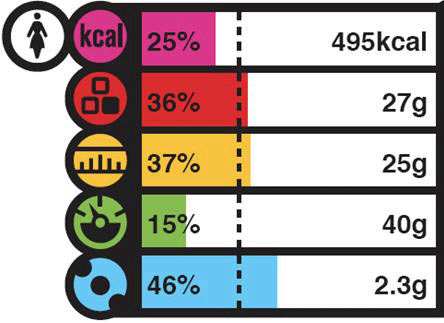
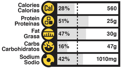
"All of the icons were designed to print in multiple colors, two-colors, and single color, depending on the package design needs for our various products," Frawley continues. The impact of this need for different color variations had an obvious influence on image design, re-stricting McDonald’s from using dark fill colors or patterns with the visuals. "Our goal is to consistently use the same visuals in these various ways in all countries," Frawley adds. Printed visuals also must work on a wide variety of packaging surfaces, ranging from "SBS" (coated carton material, like French Fry containers), F-flute (an un-coated carton material, like a Big Mac box), foam (hot breakfast containers) and paper (hamburger wrappers). All final approved images were tested in a variety of lay-outs on all packaging materials to ensure that they would print as envisioned from a clarity and color perspective. THE END RESULT "This system is intended to be an easy-to-understand, visual nutrition language," states Lisa Wolfe. "We real-ize that some of the visuals may not already be strongly linked in consumer minds to the nutrient they are meant to depict in all markets." "We intend to promote understanding of the images through supporting materials in Europe, from web sites to images explained on tray liners and via in-store displays," adds McDonald’s Karen van Bergen, Vice President of Cor-porate Relations for McDonald’s Europe Limited. "After repeated exposure to these images, customers should eventually grasp their meaning, with or without printed labels next to them." "We strove to create an easy, simple to understand chart," van Bergen continues. "We took the concept to the designers and checked results with consumers. We involved and listened to the institutional stakeholders be-fore returning to the Europe Nutritional Steering Group, and repeated the process. After the fourth trial," van Bergen concludes, "we found the solution." The next illustration shows the full-color nutrition information system for Europe and the two-color chart used in the USA (for two different menu items) that in-cludes the global nutrient visuals developed and cleared in this process. Note that the USA version uses text la-bels next to the icons, (two languages is the maximum that would fit), while the European version does not use text. The dashed line indicates one meal or one third of a day’s recommended allowance. An interactive version of the European food chart may be found on the web at www.mcdonaldsmenu.info. Information on nutrients beyond the basic five in the chart can also be found on this site.
LESSONS LEARNED So, how much wiser are team members after having analyzed over 13,000 comments and having tested doz-ens of variations of the nutrient visuals? And was it really possible to come up with one icon for calories that works flawlessly in all regions of the world? Well, almost.
In part one of this article, we asked you if a swirl looked like an avalanche or a calorie. That swirl (and many other prototypes) was rejected as the visual for a calorie: in various countries it was associated with concepts as diverse as "dizziness", "laundry spin cycle", "avalanche warning" and various weather symbols. Mc-Donald’s and ENLASO discovered that an established ab-breviation for calories, "kcal" or "Cal" could be used in most western countries. However, a non-language calorie image was required for many markets. A "sun burst" or "radiant dial" visual was eventually approved as the most appropriate choice. Global cultural feedback indicatedthat most countries would associate this image with the sun or energy, a parallel to calories and "food energy". The final icons for calorie are shown at the beginning of this paragraph. Although ENLASO and McDonald’s have made every effort to qualify and select icons that could work in all locales, obviously some compromises had to be made. "Cultural feedback was weighed primarily from our top 10 countries, which constitute about 80% of our business," notes Bridget Coffing, McDonald’s Vice President of Cor-porate Relations. "We have accomplished our mission: keep the information simple, easy to understand, lan-guage-free and top line." Coffing emphasizes that the top five nutrients on the packaging are just part of an overall nutrition initiative to help consumers be more aware of their many food choices. BREAKING NEW GROUND Everyone interviewed for this case study conveyed tangible enthusiasm over the potential for the nutrient images and bar chart to communicate critical informa-tion to more people worldwide. Coffing adds "This initiative will transcend language barriers, extending these efforts globally, even into areas with limited literacy or to consumers who may have difficulty reading small print." Since 50 mil-lion people worldwide are served at McDonald’s each day, this initiative is clearly an important one that can touch many lives. Karen van Bergen, Vice President of Corporate Relations for McDonald’s Europe Limited, who was involved in Europe at the project’s inception, is proud of the company’s commitment to extend nutrition literacy. "We have created a nutrition language," she affirms. "We would like it to as-sist consumers in making decisions for a balanced diet." According to van Bergen, the concept of McDonald’s itself is concise, convenient, and immediately recognizable. "The science behind nutrition is very complex, but because of these compelling, culturally proven images, you can quickly recognize them." The learning process was equally potent for the ENLASO half of the team. "I know that the word partnership took on new meaning for both com-panies," concludes ENLASO Vice President Yves Lang. "I am proud that ENLASO played such a stra-tegic part in this pioneering effort by one of the world’s most recognized and respected brands." "What may surprise some people," observes ENLASO project manager David Dunn, "is how incredibly committed everyone from McDonald’s is to this nutrition information initiative. I think a lot of people in North America may still think of McDonald’s as just being a quick place to eat. My contacts at McDonald’s were so thoroughly committed to the initiative." And one should never make assumptions about how other cultures view the world, reflects Dunn. "There were all of these simple little images, which evoked such a wide collection of responses," he continues. "Always be open to another culture’s perceptions, and learn not to judge that feedback through the lens of your own experi-ence." Dunn recalls having lived in the American Southwest near a cliff with pre-historic petroglyphs, ‘icons’ of their era. "I would see all sorts of people from many different cultures around the world," Dunn recalls. "They would just stand there and stare at the ancient images for hours on end." There is something very potent about simple, even primitive images. "The response such images evoke may not always be universal," concludes Dunn, "but the potency of such images can be universal. Visuals resonate with all peoples." Dunn admits that he occasionally found himself pausing to stare at some of the new icon images, just like tourists viewing those ancient petroglyphs.
One thing is certain: this project is unique. "To my knowledge, no other corpora-tion has done such extensive, global cultural testing of im-ages," concludes McDonald’s Lisa Wolfe. "How many com-panies can you think of that tried to find out which image makes sense for ‘protein’ in China and 108 other coun-tries?" The time and expense that went into this project are noteworthy due to the vol-untary nature of McDonald’s actions in creating this global visual nutrition language, then making it freely available for reapplication throughout the food industry. McDonald’s has already achieved universal recognition for one image: the Golden Arches. Perhaps, through time and repeated exposure, this new language of nutrient images will eventually become just as universally recognized. ABOUT THE AUTHOR Maxwell Hoffmann (mhoffmann@translate.com) manages Consulting and Training Solutions for ENLASO CORPORATION. He has authored numerous case studies on topics ranging from "Online Dating" to "Challenges in Bidirectional Language Translation". For the past 10 years he has specialized in data migration, XML and process training for the translation industry. Hoffmann did not work directly on the project covered by this case study, but brings an objective and unique perspective to the project’s outcomes based on his background in graphic arts and typography. Hoffmann initially worked as a commercial artist, designing several corporate logos, before moving into typesetting, then Desktop Publishing. He has created single-source publishing solutions for over 15 years and has trained over 1,000 customers and sales professionals. ClientSide News Magazine - www.clientsidenews.com
E-mail this article to your colleague! Need more translation jobs? Click here! Translation agencies are welcome to register here - Free! Freelance translators are welcome to register here - Free! |
|
|
Legal Disclaimer Site Map |

 Croatia:
"Looks like something heavy, therefore not good." Argentina,
China, Czech Republic, South Africa: "Looks like a lock,
or a security device, or something that symbolizes security
measures." Australia, Brazil, Poland: "Looks like a handbag,
a purse or a bell."
Croatia:
"Looks like something heavy, therefore not good." Argentina,
China, Czech Republic, South Africa: "Looks like a lock,
or a security device, or something that symbolizes security
measures." Australia, Brazil, Poland: "Looks like a handbag,
a purse or a bell." Scotland:
"Resembles orange and black signs used with Glasgow subway
system." Canada: "...yellow and black evoking road signs
colors." Ireland: "Colors resemble road signs." Denmark:
"... issue here could be that orange/black color combination
is normally used on "-danger symbols"."
Scotland:
"Resembles orange and black signs used with Glasgow subway
system." Canada: "...yellow and black evoking road signs
colors." Ireland: "Colors resemble road signs." Denmark:
"... issue here could be that orange/black color combination
is normally used on "-danger symbols"."