 |
 |
 |
| Home | More Articles | Join as a Member! | Post Your Job - Free! | All Translation Agencies |
|
|||||||
|
|
Creating a New Language for Nutrition: McDonald’s Universal Icons for 109 countries. Part 1.By Maxwell Hoffmann, mhoffmann[at]translate.com
See also:
We present to you part one of a 2 part case study about the McDonald’s Corporation’s development of universal icons. As an ever-developing industry, most of us think about the language barriers everyday, but few of us deal with the concept of icons. Develop- ing pictures that are meaningful in over 100 countries and have no hidden meanings is a tricky task. In this case study we will see how McDonald’s develops pack- aging icons with the help of a linguistic iconographer and the challenges they met along the way. VARIATIONS IN VISUAL PERCEPTION OF IMAGES
And how do you find out if these visuals mean something to customers in Fiji, Paraguay, Sweden, China or elsewhere? McDonald’s quickly realized that they didn’t have the resources and expertise to conduct such a massive research effort in a timely manner. Knowing that traditional marketing research firms weren’t likely to have the needed experts, McDonald’s searched for firms that specialized in global cultural interpretation and chose ENLASO to manage McDonald’s and ENLASO focused on five main nutrient visuals (calories, fat, carbohydrates, protein, salt) that would be used globally on packaging, and also designed and evaluated half a dozen supplemental nutrient visuals that might be needed in some locales. The team had to deal with four main challenges:
The findings from this research were often surprising, and sometimes even amusing. But after ENLASO distilled over 13,000 comments from cultural imagery experts around the world, McDonald’s has successfully established the basis of this new visual language of nutrition. The company is sharing the icons with its customers everywhere and has made them freely available for unrestricted use within the restaurant and food industry. The focus of this case study is on the development of the nutrient visuals and their cultural evaluation, and covers the many steps and surprises in this unprecedented effort. IN THE BEGINNING"McDonald’s has been sharing nutrition information about our food for over 30 years," says Bridget Coffing, Vice President of Corporate Communications for McDonald’s. "We wish that more consumers were aware of that information, and that they took advantage of the many ways we’ve been providing it, such as on our web site, tray liners, posters, and brochures." "Furthermore, we know from a variety of research studies that consumers often find existing traditional packaged goods nutrition labels confusing," adds Lisa Wolfe, Director of Balanced Active Lifestyles Research in the McDonald’s Global Consumer and Business Insights Department. "We knew that simply replicating existing packaged foods formats wouldn’t be enough, that our customers are expecting meaningful innovation in this area." This is where the influence of the McDonald’s Europe business unit was pivotal. They were operating in an environment where the European Union (EU) had laid out minimum guidelines on the communication of nutrition information for the packaged foods industry. Furthermore, a new initiative named the EU Platform on Diet, Health and Physical Activity was created in March 2005. The purpose of this platform was to prompt voluntary commitment from the food and food service industries, which were genuinely interested in dealing with obesity, and to offset the need to create action through legislation. In November 2004, the McDonald’s Europe management team made a decision not only to voluntarily embrace the EU platform, but to lead by example and create new guidelines. McDonald’s established the Nutrition Information Initiative (NII) to define and implement an enhanced nutrition information system that could communicate to customers in a simple, short, visual and easy to use way. "We thought that this was an excellent opportunity for McDonald’s to provide leadership in labeling, with a genuinely innovative, science-based approach," relates Alastair Fairgrieve, McDonald’s Europe Chief Insights Officer, and the European research lead for the NII effort. "Our strategy was to listen to and involve consumers, engage political and civil organization stakeholders and consult with scientists. The stakeholders we consulted included consumer groups, EU institutions, civil society and companies, comprising nearly 50 outside experts." Based on this input, McDonald’s developed its system for Europe, including visuals (icons) to represent key nutrients, an accompanying bar chart detailing key nutrient levels, and the percentage of GDA (Guideline Dai- ly Amounts) that the nutrients represent. McDonald’s chose to use nutrient visuals rather than words because visuals can universally communicate concepts without language. This was important because it eliminated a notable nutrition labeling barrier for Europe’s quick service industry, given the many languages that would otherwise be required on small, single-serve food packages. The labeling system focused on five key nutrients that were most often referenced by the nutrition and scientific communities and consumers as the most important: calories, protein, fat, carbohydrates, and salt. Visuals were developed for additional nutrients such as fiber, sugar and saturated fat to allow for local flexibility. EARLY ICON DEVELOPMENTEarly on, the McDonald’s team discovered there were no established standards for "language free" nutrient visuals that could be copied or modified. Even the European version of the nutrition table proved to be of little help. Fairgrieve relates the importance of primary research in providing direction for the visuals: "The NSG (McDonald’s Europe Nutritionist Steering Group, comprised of independent nutritionists) provided us with definitions of nutrients. For instance, protein acts as a building block, and carbohydrates are what fuel you. So, we had precise descriptions to share with our design firm to create the visuals." Designers at UK-based Boxer Design Consultants tried a variety of early prototypes before hitting the mark. "Our goal was to make the visuals so obvious that a five-year-old could understand them," recalls Stuart Ruff, Art Director. "We had very detailed scientific background on the function of each nutrient, so the intended meaning of the symbols was well laid out." Early test designs were discarded, including abstract symbols resembling molecular structure. Three of the five main nutrients (protein, carbohydrates and fat) "jelled" fairly early in the design phase. The basic concept of "building blocks" for protein, "fuel gauge" for carbohydrates and "measuring tape" for fat remained relatively intact throughout the design process. Other icons, like calories and salt, proved to be more of a challenge. Early rejected concepts for the five key nutrients are compared to the final images below: 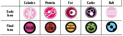
GOING GLOBAL The original plan was to include nutrition information using these nutrient visuals on European packaging. While the system was being designed in Europe, McDonald’s personnel in other parts of the world were also trying to take product nutrition transparency to the next level. Many consumers weren’t aware of the nutrition information McDonald’s had been providing. The company investigated several options to better meet consumer needs, but found that a simple format, with key information on packaging, was the preferred global solution. McDonald’s had also experimented with reapplying traditional packaged goods nutrition information formats to packaging in some parts of the world. However, the traditional format was designed for the packaged goods industry for products that would be used at a later time, so it wasn’t ideal for McDonald’s single-serving immediate use products. And merely reapplying the packaged goods format did nothing to address the "difficult to use and understand" issues with this format documented in numerous independent research studies. Encouraged by internal research and by stakeholder feedback on the European prototypes, the McDonald’s global management team realized that the European system had the potential to "go global." After reviewing the evidence, McDonald’s made the bold decision to develop a universal language for sharing nutrition information that could be used in its 30,000+ global restaurants. This decision to go global created some challenges. Because the initial visuals had been designed for a European audience rather than a global one, cultural analysis was needed to ensure that the visuals would be acceptable in all countries. And because many markets, including Europe, share packaging due to their geographic proximity, the visuals needed to be easily recognizable so as to be usable with or without language. This is because some packages could be used in countries collectively speaking over 10 languages; written descriptions next to a visual for that many languages would not be feasible, due to space limitations. The chart below illustrates this dilemma: 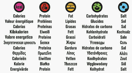 THE NEED FOR CULTURAL ANALYSIS Early feedback from McDonald’s employees outside of Europe uncovered significant disparities in how some of the nutrient visuals were interpreted. "It was important to McDonald’s that none of the nutrient visuals convey unintended or hidden meanings in our various markets," relates Lisa Wolfe. "We realized that there was no way we could identify these issues by ourselves, so we searched for a firm with this capability." After an extensive industry search for visual interpretation research, Wolfe discovered ENLASO (www.translate.com). "Ironically, I didn’t know that there was such a thing as a ‘linguistic iconographer’ before this project," Wolfe commented. The scope of the task was likely to be daunting to even the best global supplier - there were 15 visuals to be checked in 109 countries. "When McDonald’s first approached us with this project of unprecedented scope, I initially doubted whether we could pull together such massive resources under such a tight deadline," admits Yves Lang, Vice President of Sales and Marketing for ENLASO. "After consulting our team, I quickly realized that this is exactly the type of challenge we are equal to, and we completed the project successfully under very tight deadlines." Wolfe concurs. "The ENLASO team did an excellent job of coordinating this project, which involved a large number of visuals and countries. I attribute this to ENLASO’s project management skills." Both ENLASO and McDonald’s attribute much of the project’s success to the team’s commitment to stay focused on very selective goals. BREAKING DOWN THE COMPLEXITYThis project had unique challenges due to its extensive scope and the unusual nature of the subject matter. "We had over 1,500 qualified linguists to choose from, and we can do over 200 language combinations," states Yoshimi Stokes, who manages linguistic resources for ENLASO. "Localization projects in certain European and Asian languages are quite common," continues Stokes, "but how often do you have projects that require cultural feedback from Fiji, Malta and Andorra?" The ENLASO team knew that careful management would be the key to project success. Typical projects involve linguists who focus primarily on language and text. This project required a special subset of linguists who are also qualified as iconographers: specialists who can also provide cultural feedback on how images are interpreted based on local values and traditions. Rather than engage and manage 109 individual linguists/iconographers, Stokes was able to locate resources that could cover more than one country within a region, thereby substantially reducing project complexity. "For instance," she continues, "we found one source to cover Fiji, Tahiti and the Reunion Islands." Additionally, some countries posed multi-lingual or multi-ethnic challenges in cultural review. "Belgium has Dutch, French and German speaking people," reminds linguist/iconographer Denise Pitz, "so you don’t have just one universal reaction." According to Pitz and other linguists, much of the evaluation can be subjective and these varying reactions needed to be taken into account. "You need to make a quick, accurate assessment of the icon," Pitz states. "You base feedback on common images the broad public is exposed to. You don’t conduct research by looking up icons or images in books." To ensure that the team of chosen linguists approached the effort in a consistent manner linguist/iconographers were carefully qualified, and trained to follow strict project guidelines. Wolfe and the ENLASO McDonald’s account team developed a template for the visual review process that checked for 8 basic criteria:
Hélène des Rosiers, who conducted French Canadian cultural review for ENLASO, was impressed by the careful thought put into McDonald’s criteria. "In the past, other clients’ surveys have had ‘loaded’ questions in terms of whether an image had ‘negative’ connotations regarding religion," she observes. "The questions in the McDonald’s feedback sheets were better formulated because they were more specific. They were neutral in that they were not clueing the reviewer as to whether something should be negative or positive." According to des Rosiers, the key to good analysis is objectivity. "You have to have a fresh mind, to be prepared to find ‘nothing’ if there is nothing negative with an image. In other words, don’t try to ‘read’ something into it." "When you talk about belief-based connotations," concludes des Rosiers, "even in the USA, when you go from Texas to New Jersey you have very different cultures. French Quebec is North American, but definitely has a French heritage. All of these elements come into play when doing analysis." "Training was also the key," maintains ENLASO’s Stokes. "Examples of an ‘ideal feedback sheet’ (filled in with data) were distributed to all linguists/iconographers to ensure that the level of detail was consistent." ENLASO team members monitored files as they came in, rather than waiting for them in batches. "That way we were able to identify any problems or inconsistencies early on, and correct them," says Stokes. By the way, "at McDonald’s request, the linguists did not know who the customer was, so the evaluations were not influenced by personal preferences regarding that brand." ABOUT THE AUTHORMaxwell Hoffmann (mhoffmann@translate.com) manages Consulting and Training Solutions for ENLASO CORPORATION. He has authored numerous case studies on topics ranging from "Online Dating" to "Challenges in Bidirectional Language Translation". For the past 10 years he has specialized in data migration, XML and process training for the translation industry. Hoffmann did not work directly on the project covered by this case study, but brings an objective and unique perspective to the project’s outcomes based on his background in graphic arts and typography. Hoffmann initially worked as a commercial artist, designing several corporate logos, before moving into typesetting, then Desktop Publishing. He has created single-source publishing solutions for over 15 years and has trained over 1,000 customers and sales professionals. Next month, join us in the continuation of McDonald’s universal icon development including: researching symbols in other countries, the role of color, legal issues, and the final product. ClientSide News Magazine - www.clientsidenews.com
E-mail this article to your colleague! Need more translation jobs? Click here! Translation agencies are welcome to register here - Free! Freelance translators are welcome to register here - Free! |
|
|
Legal Disclaimer Site Map |
 Is
it a lollipop? Is it a warning for an avalanche? Or, is
it a calorie?
Is
it a lollipop? Is it a warning for an avalanche? Or, is
it a calorie?