 |
 |
 |
| Home | More Articles | Join as a Member! | Post Your Job - Free! | All Translation Agencies |
|
|||||||
|
|
Gentium: Providing Type to the World
Gentium is a Unicode typeface that contains Roman, Greek and Cyrillic characters, including many characters seldom seen in even the most ambitious typefaces. Far from being a luxury, these characters are needed to write many of the over 6,000 languages thought to exist in the world. In this interview, Victor Gaultney, who originally created the typeface as part of a masters program at Reading University, discusses the Gentium project, the task of making a typeface look “right” for various areas, and how the creation of typefaces for less common languages can help eliminate the “Digital Divide.”  INSIDER: Why did you create Gentium? It
seems like rather atypical (i.e., ambitious) for a master’s
project in typography, especially as you’ve gone
into design issues few professional type designers deal
with at all during their careers.
INSIDER: Why did you create Gentium? It
seems like rather atypical (i.e., ambitious) for a master’s
project in typography, especially as you’ve gone
into design issues few professional type designers deal
with at all during their careers.
Victor Gaultney: Two motivations directed my work from the beginning. First, I was working on a master’s degree in typeface design at the University of Reading, and needed a font project to fulfill academic requirements. Alongside that, I wanted the project to have some larger purpose - to address a practical need. 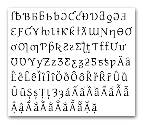
Some of the more than 1500 glyphs in Gentium Gentium was driven by the need for a free, attractive, legible, high-quality font for extended Latin (and Greek and Cyrillic) use. Nothing else was available that was suitable for publishing use, so I decided to give it a try. I leveraged some of my University research in readability, extended Latin fonts and diacritic design to make it really work well. Yes, I did a bit more than the University required, but it is helping a lot of people, and that’s what counts. Many major private corporations realize that they have a moral duty to welcome the developing nations into their world, and find that doing so can be a smart business decision. INSIDER: Why did you transfer Gentium to SIL International, rather than taking it commercial or maintaining it privately? Victor Gaultney: I’ve been a type designer with SIL International for over ten years, working mostly with non-Latin scripts, and it seemed natural for SIL to be the home for my latest work. I’ve had inquiries about commercial distribution, but the whole purpose has been to provide a font for the millions of people out there who use extended Latin scripts, but are poorly served by the commercial market, or cannot afford to purchase fonts. I also did not have all the extra time it would have required to keep Gentium going on my own. SIL is also a solid organization with good exposure, rich technical expertise, and proven care for minority peoples. Gentium is in good hands there, and will benefit from the work of a whole team of people, not just myself. It will continue to remain free, and I will still be primary designer. The whole purpose is to provide a font for the millions of people out there who are poorly served by the commercial market. INSIDER: Do you have any plans to “enhance” Gentium with OpenType advanced features? Victor Gaultney: Yes! We’re working even now to extend the character set to include a whole slew of characters added in Unicode 4.0, and linking everything up with smart rendering features is in our plans. We will include OpenType support alongside support for our own open source rendering system - SIL Graphite. We also want to address some of the major requests that we’ve received from users: more weights (bold and bold italic) and additional character support (archaic Greek, extended Cyrillic, etc.). INSIDER: Who are the primary users of Gentium to date? Do you know of any uses by publishers or in commercial work to improve multilingual support? Victor Gaultney: That’s hard to know. We have thousands of downloads each month, but only a very few have subscribed to the Gentium-announce mailing list. A quick look at the domain names shows a very broad international and organizational scope. Gentium has managed to break down some of the barriers between people. There used to be a wide gulf between the greater publishing, academic and multilingual communities. From comments, however, we know that it is used heavily for multilingual use, primarily in academic circles - by linguists, musicians, librarians, and the like. The polytonic Greek support makes it popular among classicists and Biblical experts. A great number, however, are people who have read about Gentium because of the design awards it has received and want to use it for publishing in English and other mainstream languages. Still others use it because it is the only font that contains all the letters needed for their language. Gentium has managed to break down some of the barriers between people. There used to be a wide gulf between the greater publishing, academic and multilingual communities. Publishers would hesitate to do work in unusual languages because the available fonts were so poor. Academics had to do their own thing because the industry did not support their needs. Multilingual publishing has often been a constant struggle with incompatible solutions of varying quality. Now everyone can use the same font - and get excellent quality, readable, attractive text. INSIDER: In your opinion, has general awareness of multilingual type needs improved? Victor Gaultney: I think so. The typographic community has always been fascinated by interesting alphabets, but the technical solutions have been niche items. The average book designer has had little access to them even if they were just curious. There is, however, much greater awareness now, because solutions are more accessible. Multilingual publishing has often been a constant struggle with incompatible solutions of varying quality. This awareness and interest can be seen in the content of conferences and books. The primary conference of the type community, ATypI, recently featured many hours of content on non-European publishing. In 2002, ATypI and Graphis published a large volume - Language Culture Type: International Type Design in the Age of Unicode. The interest has always been there, but needed the software industry to make participation in multilingual publishing more possible. INSIDER: Right now Gentium covers the Roman, Cyrillic and Greek scripts, scripts that are historically very closely related and that share certain conventions. Do you have any plans to add other historically-related scripts, such as Armenian, that might not be as easy to integrate into a single type face? Victor Gaultney: The Cyrillic is still a work-in-progress. Although in the plans from the beginning, it was not completed as part of my academic program and is still in development. An early draft of the Russian letters slipped its way into the first release, but a much-refined version will appear in the next one. I commonly get requests for other scripts, especially Hebrew. And I’ve thought a bit about Armenian - it’s such a beautiful script! At this point, though, we’re not planning to add more scripts. We have enough to do with extended Latin, Greek and Cyrillic. But I reserve the right to play around a little now and then. We are also trying to find a good way for others to contribute to the project, so if someone wants to try a Gentium Hebrew they will have all they need. It will take awhile for us to get a system set up for this, so don’t hold your breath. What we’re missing is an open, community-wide guide to the design of less common glyphs. INSIDER: A common complaint with type faces that unify a number of scripts (such as Adobe’s Minion) is that they make the non-Roman characters look very Roman; e.g., Minion Cyrillic looks very Western to Russians or Bulgarians and stands out as a face not designed within a native Cyrillic tradition. What challenges did you face in making sure that your glyphs would look appropriate for the languages that use them? Victor Gaultney: My goal with Gentium was to create a good extended Latin typeface, and at the same time create a Greek typeface that is as naturally ‘Greek’ as possible. I did not create a Greek version of Gentium. I designed a Greek typeface that shared some design characteristics with Gentium Roman. There may be similarities between shapes, but that does not mean they should be identical. There are lots of issues with general style as well as letter frequency, etc. For example, the Latin ‘o’ and Greek ‘omicron’ share the same nominal shape. I found, however, that due to the nature of the Greek alphabet, and the combinations of letters that included the omicron, that I needed to change the shape for the Greek. There are also many Greek letters that have been grabbed for use in extended Latin work. So I designed two versions of many of those - one for the Greek and one for the extended Latin (see the illustration below). Lots of work, yes, but worth it. 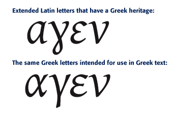
Language-appropriate design is challenging, especially if you did not grow up reading and writing the script. It takes research and expert help. I did a lot of homework, and looked at a lot of other fonts. Gerry Leonidas of the University of Reading patiently waded through version after version of my work to ensure that it was properly Greek. It seemed to work - over half of our users download it for the Greek. I’m receiving similar expert consultation on my Cyrillic. It is not enough, however, to simply store your data in Unicode. INSIDER: Gentium was featured as part of the bukva:raz! exhibition at the United Nations. Tell us more about this exhibition and how Gentium was received. Victor Gaultney: bukva:raz! (Russian for letter:one!) was an international type design competition sponsored by ATypI in 2001 in celebration of the United Nations’ Year of Dialogue Among Civilizations. Its purpose was to honor the best typeface designs - both Latin and non-Latin - of the previous five years. I’m very pleased that Gentium was chosen as one of the winners. As a result, it was part of a touring exhibition that debuted in the Main Lobby of the United Nations Headquarters in New York, and has now traveled around the world. More recently, Gentium won the Type Directors’ Club TDC2 2003 type design competition, as well. The type community has been very encouraging and supportive. Designers understandably treat people offering free fonts with suspicion, but they have welcomed Gentium warmly. They see that it meets a need in the developing world, and I’ve received many offers to help with design and promotion. Typographers are interested in good publishing, and see this as a way to provide it to a broader community. INSIDER: In some of your writing you talk about a lack of publicly-available information regarding type design for some languages. The Unicode 4.0 publication also mentions lack of information as a constraint in a number of instances. As localization increases for less-common languages, these sorts of information constraints will be increasingly important to commercial endeavors. How did you deal with lack of definitive information about various languages in designing Gentium? Was this even an issue for the languages Gentium covers? What sorts of resources have you found the most useful? Victor Gaultney: This continues to be a difficult issue. For example, if I want to add a glyph for one of the new Unicode 4.0 characters, I need to know how it is used, what letters it is commonly near, and preferably where it comes from - the story behind the letter. The Unicode Standard just gives me character information, not how the letter is actually supposed to look. This is not an oversight, it is the nature of a character standard. I have benefited greatly from SIL’s experience in designing fonts for minority languages around the world. I share an office with people with vast experience, and have relationships with other, non-SIL designers who have done considerable research, like John Hudson of Tiro Typeworks. For the last decade I’ve relied on script experts around the world to give me individual help on unusual alphabets. The trouble is that not all the expertise is gathered in one place. In the case of extended Latin letters, what we’re missing is an open, community-wide guide to the design of these glyphs. Ideally, there would be a place on the Web where people could learn about individual letters and letter families, what languages they are used for, and themselves contribute to the knowledge. In lieu of that, there are some resources available, but they are limited. Microsoft has a good guide to the design of some more common extended Latin letters. Some information on specific glyphs is available, such as Adam Twardoch’s pages on Polish diacritics. The TYPO-L, Type-Design and ATypI (available to ATypI members only) mailing lists can be helpful places for discussion. Unicode has given us a single standard for encoding character data - and that is great. We now need an easier way for application developers and font designers to consistently render Unicode text - outside Microsoft Office. INSIDER: A practical difficulty with Unicode today is a lack of end-user applications that really support Unicode, although this has improved dramatically in the last few years. What do you see as the strengths and weaknesses of present-day Unicode implementation? Victor Gaultney: Unicode is pretty solidly accepted now, even though some apps still have not been revised to support it, especially on the Macintosh. It is not enough, however, to simply store your data in Unicode. The application needs to be able to render the Unicode text appropriately. To display stacking diacritics, for example, say o + circumflex + acute, the application needs to recognize that the diacritics must be stacked one on top of another, and if the language is Vietnamese, possibly replace them with a special Vietnamese circumflex-acute combination. An easy way for applications to support this behavior - through support of ‘smart’ fonts - is the most pressing need today. OpenType has been the most successful rendering system, and smart font format, to date, but even it is at an early stage of development. Of the major software vendors, only Microsoft and Adobe have embraced it in their apps (and not even in all of them), and even they differ in some parts of their implementation. This is somewhat due to the OpenType requirement that the applications have some understanding of the writing system. Applications can easily differ in support for particular behaviors, depending on what they think is necessary. It’s a bit of a mess. Only big companies like Microsoft have the resources to do the research needed to support a myriad of languages. There are other systems, but few applications use them. Apple’s AAT and ATSUI are in many ways superior to OpenType, and provide flexible services to all apps that use it - without requiring any understanding of the writing system. It works great, but developers are not using it, and font manufacturers have ignored it. SIL’s open source rendering system (for Windows and soon for Linux) - Graphite - is more powerful than either of these, but is also not widely supported. Unicode has given us a single standard for encoding character data - and that is great. We now need an easier way for application developers and font designers to consistently render Unicode text - outside Microsoft Office. INSIDER: Although the roots of the “Digital Divide” (the differential access between different nations and peoples to the advantages of modern information technology) are a complex topic, at least one contributing factor is a lack of locale-appropriate linguistic resources (such as fonts, collators, spell checkers) for the vast majority of the world’s languages. How do you see your work, and the work of SIL International, as contributing to a solution to the problems of the Digital Divide? Victor Gaultney: Gentium is one way in which we are trying to eliminate the Digital Divide. For years, we in SIL have developed fonts, keyboards, and conversion systems for writing systems around the world, with a focus on those peoples underserved by the major software companies. More recently, we have been trying to disseminate our knowledge and experience to others, and enable them to develop solutions on their own. We’ve been speaking at conferences, submitting articles for journals, and have our own Web site dedicated to Computers and Writing Systems - scripts.sil.org. The Digital Divide will not disappear until mainstream computer operating systems and applications acknowledge that they cannot assume to know in what language the user wishes to communicate. The assumption should be that their software can support any writing system - whether majority or minority - for which a font and rendering information are available. We in SIL are just pleased to be able to help the industry make that transition, and provide tangible solutions to those who need it. INSIDER: How can other individuals who feel strongly about the need to extend computing and language support to the “rest” of the world best contribute to realizing the goal of providing equal access to computing resources? Victor Gaultney: Start small, and within your own sphere of influence. When you might normally limit software to a specific set of users, try to find a way to include more of the developing world. Don’t assume that all your users will want to communicate in European languages. You can also contribute time and expertise to the many open source projects out there, and find ways to make them less Euro-centric. Even many major private corporations realize that they have a moral duty to welcome the developing nations into their world, and find that doing so can be a smart business decision. Gentium is available from scripts.sil.org/gentium. has been a typeface designer with SIL International for twelve years. He has worked extensively in the area of non-Roman font design and development, and has won multiple international design awards. Victor has been a consultant to major computer companies, and received his education at St. Olaf College, Minnesota, USA and the University of Reading, UK. You can reach Victor at Victor_Gaultney@sil.org.
Reprinted
by permission from the Globalization Insider,
4 November 2003, Volume XII, Issue 4.3. Copyright the Localization Industry Standards Association (Globalization Insider: www.localization.org, LISA: www.lisa.org) and S.M.P. Marketing Sarl (SMP) 2004
E-mail this article to your colleague! Need more translation jobs? Click here! Translation agencies are welcome to register here - Free! Freelance translators are welcome to register here - Free! |
|
|
Legal Disclaimer Site Map |