 |
 |
 |
| Home | More Articles | Join as a Member! | Post Your Job - Free! | All Translation Agencies |
|
|||||||
|
|
Scribal abbreviations
Scribal abbreviations, or Sigla (singular: siglum and sigil) are the abbreviations used by ancient and medieval scribes writing in Latin, and later in Greek and Old Norse. Modern manuscript editing (substantive and mechanical) employs sigla as symbols indicating the location of a source manuscript and to identify the copyist(s) of a work.
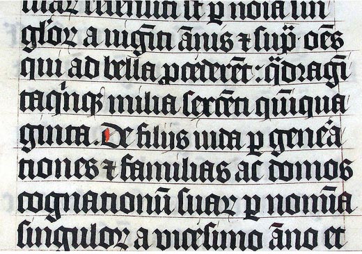
Text sample from an early 15th-century Bible manuscript. HistoryAbbreviated writing, via sigla, arose partly from the exigencies of the workable nature of the materials — stone, metal, parchment, et cetera — employed in record-making, and partly from their availability. Thus, lapidaries, engravers, and copyists made the most of the available writing space. Scribal abbreviations were infrequent when writing materials were plentiful. Consequently, scribes recorded texts in long form. However, by the 3rd and 4th centuries AD, when writing materials were scarce and costly, the scribe-artists became sparing in their use of the limited writing surface when inscribing long texts to record. During the time of the Roman Republic, several abbreviations, known as sigla (siglum=symbol/abbreviation), were in common use in inscriptions and increased in number during Roman Empire. Additionally, in this period shorthand entered general usage. The earliest western shorthand system known to us is that employed by the Greek historian, Xenophon in the memoir of Socrates, called notae socratae. In late republican times, the Tironian notes were developed possibly by Marcus Tullius Tiro, Cicero’s amanuensis, in 63 BC in order to record information with fewer symbols; Tironian notes include a shorthand/syllabic alphabet notation different from the Latin minuscule hand and square and rustic capital letters, which is akin to modern stenographic writing systems, and also symbols for whole words or word roots and grammatical modifier marks and could either be used to write whole passages in shorthand or only certain words. In medieval times the symbols to represent words were widely used and the initial symbols, which were as low as 140 according to some sources, were expanded to 14,000 by the Carolingians who used them in conjunction with other abbreviations. However, the alphabet notation had a “murky existence” (C. Burnett) as it was often associated with witchcraft and magic and was eventually forgotten. Interest in it was rekindled by the archbishop of Canterbury Thomas Beckett in the 12th century and later in the 15th, when it was rediscovered by Johannes Trithemius, abbot of the benedictine abbey of Sponheim, in a psalm written entirely in Tironian shorthand and a Ciceronian lexicon, which were discovered in a Benedictine monastery (notae benenses). To learn the Tironian note system, scribes required formal schooling in some 4,000 symbols; by the Classical period (c. 7th century BC to 5th century AD), the number increased to some 5,000 symbols, then to some 13,000 in the medieval period (4th to 15th centuries AD); to date, the denotations of some characters remain uncertain. Sigla are mostly for lapidary inscription; in certain late historical periods (e.g. medieval Spain), scribal abbreviations were over-used to the extent that some are indecipherable. Moreover, in the 21st century, sigla are a public matter, because, in re-establishing post–Devolution Scots law, the Scottish Parliament must decipher their meaning(s) as used in the old, Latin-language Scottish law codes. Latinists who have not learned the palaeography of the language cannot decipher many of the thirteen thousand medieval sigla used to write these laws. FormsThe identity and usage of abbreviations is not constant but changes from region to region. Scribal abbreviation increased in usage and reached its height in the Carolingian Renaissance (8th to 10th centuries). The most common abbreviations, called notae communes, are encountered across most of Europe, whereas others appear in certain regions. Additionally in legal documents not only do legal abbreviations, called notae juris, appear but so also do capricious abbreviations, which scribes manufactured ad hoc to avoid repeating names and places in a given document. Scribal abbreviations can be found in epigraphy, sacred and legal manuscripts, written in Latin or in a vulgar tongue (though less frequently and with fewer abbreviations), either calligraphically or not.
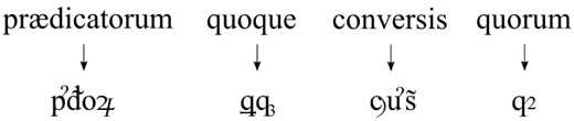
Latin abbreviations of praedicatorum, quoque, conversis, and quorum. In epigraphy, common abbreviations were comprehended in two observed classes:
These two forms of abbreviation are called “suspensions” (as the scribe suspends the writing of the word). A separate form of abbreviation is by “contraction” and was mostly a Christian usage for sacred words, Nomina Sacra; non-Christian sigla usage usually limited the number of letters the abbreviation comprised, and omitted no intermediate letter. One practice was rendering an over-used, formulaic phrase only as a siglum, e.g. DM for Dis Manibus (“Dedicated to the Manes”); IHS from the first three letters of “ΙΗΣΟΥΣ”; and RIP for requiescat in pace (“Rest in Peace”), because the long-form written usage of the abbreviated phrase, itself, was rare. According to Trabe, these abbreviations are not really meant to lighten the burden of the scribe but rather to shroud in reverent obscurity the holiest words of the Christian religion. Another practice was repeating the abbreviation’s final consonant a given number of times to indicate a group of as many persons, for example: AVG denoted “Augustus”, thus, AVGG denoted “Augusti duo”; however, lapidaries took typographic liberties with that rule, and, instead of using COSS to denote “Consulibus duobus”, invented the CCSS form. Still, when occasion required referring to three or four persons, the complex doubling of the final consonant yielded to the simple plural siglum. To that effect, a vinculum (overbar) above a letter or a letter-set also was so used, becoming a universal medieval typographic usage. Likewise the tilde (~), an undulated, curved-end line, came into standard late-medieval usage. Besides the tilde and macron marks, above and below letters, modifying cross-bars and extended strokes were employed as scribal abbreviation marks — used mostly for prefixes and verb, noun, and adjectival suffixes. These typographic abbreviations should not be confused with the phrasal abbreviations: i.e. (id est — “that is”); loc. cit. (loco citato — “in the passage already cited”); viz. (vide licet — “namely”, “that is to say”, “in other words” — formed with “vi” and the yogh-like glyph [Ȝ], the siglum for the suffix -et and the conjunction et), and et cetera. Moreover, besides scribal abbreviations, ancient texts also contain variant typographic characters, including digraphs (e.g. Æ, Œ, etc.), the long s (ſ), and the half r, resembling an Arabic number two (“2″). The “u” and “v” characters originated as scribal variants for their respective letters, like-wise the “i” and “j” pair. Modern publishers printing Latin-language works replace variant typography and sigla with full-form Latin spellings; the convention of using “u” and “i” for vowels and “v” and “j” for consonants is a late typographic development. Scribal sigla in modern useLatin alphabetSome ancient and medieval sigla are still used in English and other European languages; the Latin ampersand (&), replaces the conjunctions and in English, et in Latin and French, and y in Spanish (though its use in Spanish is frowned upon, since the y is already smaller and easier to write). The Tironian sign ⁊, resembling the number seven (“7″), represents the conjunction et, and is written only to the x-height; in current Irish language usage, this siglum denotes the conjunction and. Other scribal abbreviations in modern typographic use are: the percentage sign (%), from the Italian per cento (“per hundred”); the permille sign (‰), from the Italian per mille (“per thousand”); the pound sign (₤, £ and #, all descending from ℔ or lb, librum); and the dollar sign ($), which derives from the Spanish word Peso. The commercial at symbol (@), denoting “at the rate of”, is a ligature derived from the English preposition at; it became widely known internationally only when it was made part of e-mail addresses. Typographically, the ampersand (&), representing the word et, is a space-saving ligature of the letters “e” and “t”, its component graphemes. Since the establishment of movable-type printing in the 15th century, founders have created many such ligatures for each set of record type (font) in order to communicate much information with fewer symbols. Moreover, during the Renaissance (c. 14th to 17th centuries), when Ancient Greek-language manuscripts introduced that tongue to Western Europe, its scribal abbreviations were converted to ligatures, in imitation of the Latin scribal writing to which readers were accustomed. Later, in the 16th century, when the culture of publishing included Europe’s vernacular languages, Graeco-Roman scribal abbreviations disappeared — an ideologic deletion ascribed to the anti-Latinist Protestant Reformation (1517–1648). Church Slavonic
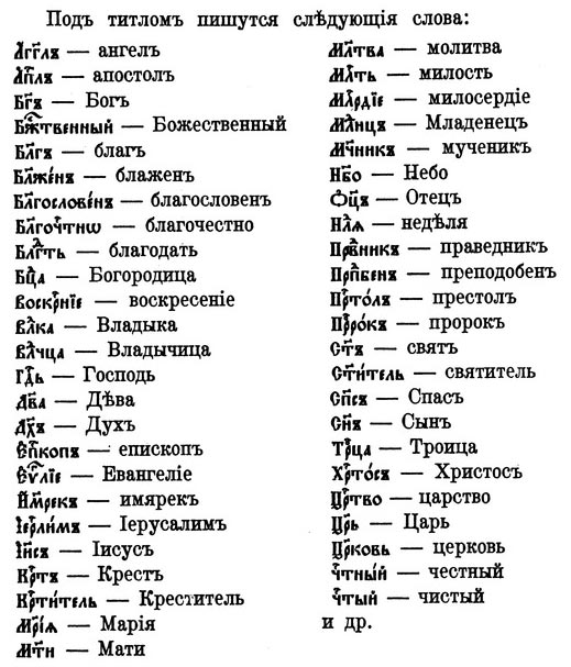
Sigla frequently used in contemporary Church Slavonic After the invention of printing, manuscript copying abbreviations continued to be employed in the Church Slavonic language and today remain in use in printed books as well as on icons and inscriptions. Many common long roots as well as nouns describing sacred persons are abbreviated and written under the special diacritic symbol titlo, as shown in the figure at the right. This corresponds to the Nomina sacra (Latin: “Sacred names”) tradition of using contractions for certain frequently occurring names in Greek ecclesiastical texts. However, sigla for personal nouns are restricted to “good” beings and the same words, when referring to “bad” beings are spelled out; for example, while “God” in the sense of the one true God is abbreviated as “бг҃ъ”, “god” referring to “false” gods is spelled out; likewise, while the word for “angel” is generally abbreviated as “агг҃лъ”, “angels” is spelled out for “performed by evil angels” in Psalm 77. Abbreviation typesAdriano Cappelli, author of lexicon abbreviarum: dizionario di abbreviature latine ed italiane, enumerates the various medieval brachigraphic signs found in Latin and Italian vulgar texts, which originate from the Roman sigla (a symbol to express a word) and Tironian notes. Quite rarely abbreviations did not carry marks to indicate an abbreviation has occurred: if they did they were often copying errors. For example, “e.g.” is written with dots, but modern terms, such as “PC”, may be written uppercase instead. It should be noted that the original manuscripts were not written in a modern sans-serif or serif font, but in Roman capitals, rustic, uncial, insular, Carolingian or blackletter styles. For more refer to Western calligraphy or a beginner’s guide. Additionally, the abbreviations employed varied across Europe. In Nordic texts, for instance, two runes were used in text written in the Latin alphabet, which are ᚠ for fé “cattle, goods” and ᛘ for maðr “man”. Cappelli divides abbreviations into six overlapping categories:
Suspension
Examples for suspension type These are terms where only the first part is written, whilst the last part is substituted by a mark, which can be of two types:
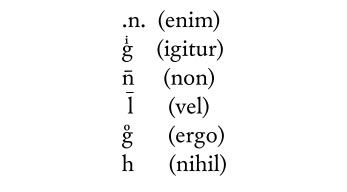
The largest class of these are single letters standing for a word starting with that letter. A dot at the baseline following a capital letter may stand for a title if used in front of names, a person’s name in medieval legal documents or other. However not all sigla use the beginning of the word.
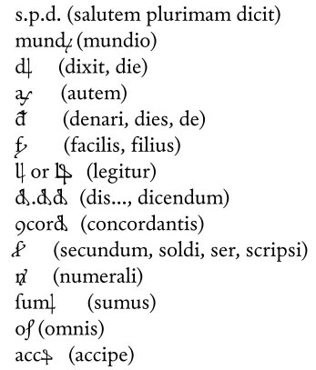
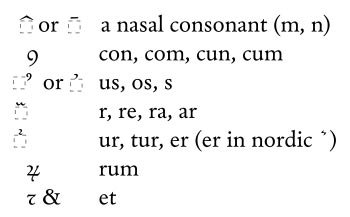
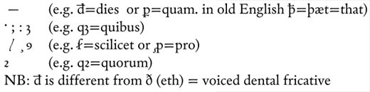
Exceptions: sigla not using the first letter of the abbreviated word For plural words, the siglum is often doubled, e.g. “F.” = frater and “FF.” = fratres. Tripled sigla often stand for three, e.g. “DDD” = domini tres. Letters lying on their sides, or mirrored (backwards), often indicate female titles, however, a mirrored C, Ɔ, stands generally for con or contra (the latter sometimes with a macron above, “Ɔ̄”). To avoid confusion with abbreviations and numerals, the latter are often written with a bar above. In some contexts, however, numbers with a line above indicate that number multiplied by a thousand whilst others several abbreviations have a line above, such as “ΧΡ” (Greek letters chi+rho) = Christus or “IHS” = Jesus, the latter two for a special case of abbreviations known as nomina sacra. Starting in the 8th or 9th century, single letter sigla grew less common and were replaced by longer, less ambiguous sigla with bars above them. ContractionAbbreviations by contraction have one or more middle letters omitted. They were often represented with a general mark of abbreviation (above), such as a line above. These can be divided into two subtypes.
Marks with independent meaning
Examples of independent marks Such marks inform the reader of the identity of the missing part of the word without affecting (i.e. independent of) the meaning, hence the term. Some of them may be interpreted as alternative contextual glyphs of their respective letters.
Marks with relative meaning
Examples for relative marks The meaning of these marks depends on the letter on which they appear.
Stacked or nested lettersA superscript letter generally referred to the letter omitted, but, in some instances, as in the case of vowel letters, this usage may refer to a missing vowel combined with the letter r, either before or after it. One should note that only in some English dialects is the letter r before another consonant largely silent while the preceding vowel is “r-coloured”. However, a, i, and o above g meant gͣ gna, gͥ gni and gͦ gno respectively. This may seem counter-intuitive to an English speaker where the g is silent in gn, but in other languages it is not. Vowel letters above q meant qu + vowel: qͣ, qͤ, qͥ, qͦ, qͧ.
Vowels were the most common superscripts, but consonants could be placed above letters without ascenders, too; the most common being c, e.g. nͨ. A cut l above an n, nᷝ, meant nihil for instance. Convention marksThese marks are non-alphabetic letters carrying a particular meaning. Several of these marks continue in modern usage as in the case of monetary symbols. In Unicode they are referred to as letter-like glyphs. Additionally, several authors are of the view that the Roman numerals themselves were, for example, nothing less than abbreviations of the words for those numbers. Other examples of symbols which have not disappeared from use entirely are alchemical symbol and zodiac symbols, which were, in any case, employed only specifically (only in alchemy and astrology texts), which made their appearance beyond that special context rare. OtherIn addition to the signs used to signify abbreviations, other features of medieval manuscripts, which are not sigla, are:
Unicode encoding of abbreviation marksIn the Unicode Standard v. 5.1 (4 April 2008), 152 medieval and classical glyphs were given specific locations outside of the deprecated private use group. Specifically, they are located in the charts “Combining Diacritical Marks Supplement” (26 characters), “Latin Extended Additional” (10 characters), “Supplemental Punctuation” (15 characters), “Ancient Symbols” (12 characters) and especially “Latin Extended-D” (89 characters). These consist in both precomposed characters and modifiers for other characters, called combining diacritical marks, (e.g. writing in LaTeX or using overstrike in MS Word). Note about terminology: Characters are “the smallest components of written language that have semantic value”, while glyphs are “the shapes that characters can have when they are rendered or displayed”.
Published - December 2013
E-mail this article to your colleague! Need more translation jobs? Click here! Translation agencies are welcome to register here - Free! Freelance translators are welcome to register here - Free! |
|
|
Legal Disclaimer Site Map |