 |
 |
 |
| Home | More Articles | Join as a Member! | Post Your Job - Free! | All Translation Agencies |
|
|||||||
|
|
How to Design and Market with Adobe
INTRODUCTIONA sales campaign is analogous to a military campaign: resources have to be assembled and then applied to an objective. In the case of a sales campaign, the objective is to capture sales. The resources that can be used in a sales campaign include banner ads and web pages. Other resources—such as traffic exchanges, blogs, ezines, and forums—can be used to help interested prospects find the banners and targeted web pages on the Internet. This article will discuss how I designed a banner ad and a web page to be used in a sales campaign. The design tools I used for the project were Adobe Illustrator, Photoshop CS2, and Dreamweaver8. Hereafter, I will refer to the design project as the ”project.“ The first challenge of the project was to develop a theme for the banner ad and web page. Note: all graphical material used for this article was created by the author. DEFINING THE THEME
An often heard complaint of initiates fighting to achieve e-commerce success is, “I'm tired of making money for uplines and nothing for myself.” Could I use this expression of frustration in my project?
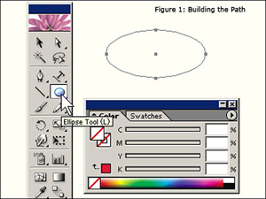
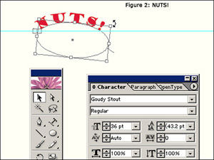
I used Illustrator to create the first four components. I then opened the Illustrator artwork with Photoshop CS2 and made separate web-optimized images for each component. I created the banner ad from the headline. Component 5 was created in Dreamweaver8 during the creation of the HTML web page, although I did do a mockup in Illustrator, first. ILLUSTRATORAdobe Illustrator makes working with text especially easy; so, I decided to use Illustrator to create the major textual and graphical elements. Starting with the headline, I opened Illustrator and added a new layer for “NUTS!” Each new element on the artboard was created in its own layer. Since “NUTS!” is such an important visual component of the project, the text had to be eye-catching—big, bold, and colorful. Placing the letters along a curved path would also help to catch the immediate attention of even a casual web surfer. I used Illustrators' Ellipse Tool to draw a curved path for the text: stroke and fill were disabled (Figure 1). After drawing the path, I was ready to use the “Type on a Path Tool” to place the text along the path. From the Type/Font menu, I reviewed the available fonts and selected 36 pt Goudy Stout; and, using a red fill for the text, I typed the text along the curved path. I used the Selection Tool to position and rotate the text as I wanted (Figure 2). Using a ruler guide helps while positioning objects on the artboard (one of these is shown in Figure 2).
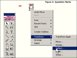
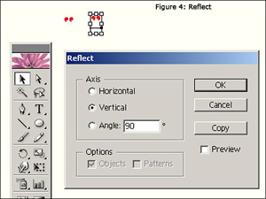
I created the quotation marks for “NUTS!” on a separate layer so I could place them around the text with non-standard positioning. After typing the first quotation mark, I duplicated it with a copy and paste. I transformed the duplicate into the right quotation mark with a vertical reflection (Figures 3 and 4).
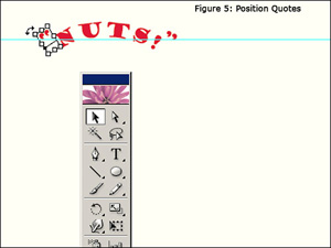
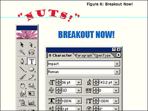
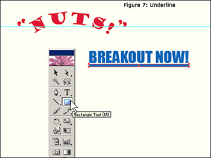
I roughly positioned the quotation marks using the Selection Tool and used the arrow keys to position them precisely (Figure 5). Next, I created the text for “BREAKOUT NOW!” “BREAKOUT NOW!” consisted of two components: the text and a graphical underline. For the text, I selected 36 pt Impact and filled it blue (Figure 6). I created the underline by simply drawing a thin, appropriately-sized rectangle with the Rectangle Tool and filling it with blue (Figure 7).
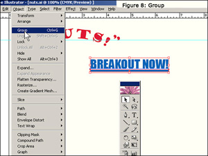
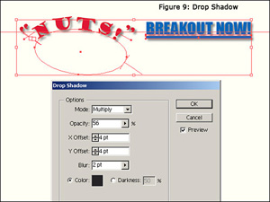
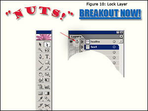
In order to move the text and graphic as a block, I used the Selection Tool to select both and then used the Object/Group menu option to group them together (Figure 8). Using the Selection Tool, I moved both the breakout text and the underline into position next to “NUTS!”. The combination of text and graphic gave the breakout part of the headline the appearance of a URL link: later, I would associate the entire headline with the URL of the targeted web page. I selected all five headline elements—right and left quotation marks, NUTS!, BEAKOUT NOW!, and the underline) and grouped them together so I could move the headline as a block. After grouping the elements, I placed a drop shadow under the headline in order to make it stand out even more (Effect/Stylize/Drop Shadow..., Figure 9). I protected my work on the headline by locking the layer. This is indicated by the small padlock shown in the headline layer (Figure 10). Locking a layer prevents accidental alteration as the work continues.
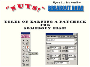
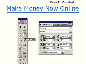
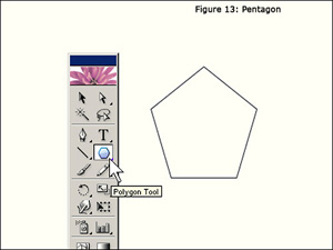
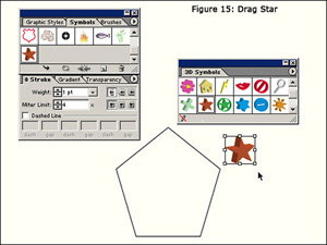
I created the sub headline using 18 pt Goudy Stout, filling the text black. I used the standard Type Tool for this and moved the text into place with the Selection Tool (Figure 11). The breakout opportunity, “Make Money Now Online,” was created in a similar manner as the “BREAKOUT NOW!” of the headline. It consisted of text (36 pt verdana) and a graphical, rectangular underline (Figure 12). The text and underline graphic were grouped together and the block was placed into position using the Selection Tool. The 5-star graphic was created by first drawing a pentagon to use as a guide for star placement (figure 13). I created a new layer and used the Polygon Tool to make a pentagon—what other polygon could be more appropriate for this project? Next, I created a new layer, above the pentagon, for the stars. From the symbol palette, I opened the symbol library and selected a star from the 3D Symbols palette and dragged it onto the artboard (Figures 14 and 15). 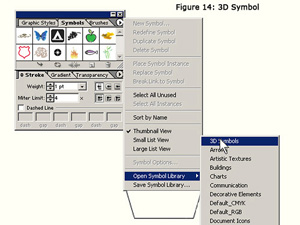
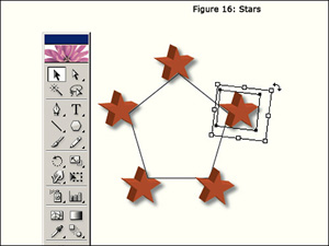
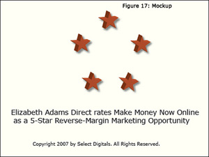
After applying a drop shadow to one star (Effect/Stylize/Drop Shadow...), I copied/pasted the star four more times onto the star layer. Using the pentagon on the layer below as a guide, I positioned the stars (Figure 16). Again, I used the arrow keys for precise positioning. I selected all of the stars with the Selection Tool and grouped them from the Object/Group menu. This grouping allowed me to move the stars as a block in order to place them below the breakout text. At this point, the major elements of the design were complete. In order to visualize what the component-5 text would look like in a web page, I added mockup text (Figure 17). I saved the project as nuts.ai. The remaining work on the graphic design was done in Photoshop CS2. PHOTOSHOP CS2I opened the nuts.ai file in Photoshop and immediately saved the file as nuts.psd. After duplicating the background layer, I turned the layer off and continued working from the copy. I renamed the duplicate layer as “nuts.” The design elements appeared on the layer with a transparent background.Starting with the headline, I cropped each element using Photoshop's Crop Tool. I saved each crop using the File/Save for Web... menu option. Because of the drop shadow in the headline and stars graphics, I saved these two elements with the same cream-colored background I would be using for the web page. This insured that the graphics would seamlessly blend with the web page background. It was not necessary to worry about the size of the crop: I cropped each element so as to leave a little bit of the background around the edges. In order to achieve the smallest file sizes for the graphics, I saved the graphics as PNG-8 files. During the save process, I adjusted the bit depth of each graphic for the smallest file size while maintaining good image quality. Photoshop's Save for the Web is a great utility for visually optimizing graphics for the web. For the web page, I had the following files:
These graphics are shown below:
Because I saved the headline and star graphics on a cream
background (#FFFEF2), they do not blend into the background
color I used for this web page (#FFFFDD). They did blend
perfectly on the web page I designed for the sales campaign,
though. The other two graphics blend perfectly because
they were saved on a transparent background and did not
have a drop shadow. Here is how the headline
looks when it is saved on a transparent background: I was confident the graphics would load quickly in a web browser because of their small file sizes. Why did I use graphics for text? I wanted to make sure that the layout would be viewed—with the same fonts and font styles—exactly as I designed it. For the banner ad, and before leaving Photoshop, I first saved the file as banner.psd. At all times, it is important to preserve source files and to work on copies or renamed files. I added a new background layer and filled it with an eye-catching yellow. From the layers palette menu, I selected “Flatten Image.” to merge the layers. I then cropped the headline to a 468x60-pixel banner using the Crop Tool. I cropped the headline so as to leave a good bit of yellow background around the text. When the crop was finally executed, the banner resized automatically to the dimensions I had entered into the tool-option bar's width and height fields. There are a couple of tricks that make precise crop selections easier. While holding down both the left mouse button and the space bar, the mouse can be used to move the crop selection into position. After the crop selection has been made, but before the selection is applied, the arrow keys can be used to nudge the crop selection precisely where desired. After flattening and cropping the banner, only one layer, the background layer, remained in the Layers palette. The special styles I wanted to apply to the banner cannot be done on the background layer, so I duplicated the layer. I could then apply additional layer styles to the banner. I renamed the duplicate layer as banner. Double clicking on the banner-layer thumbnail gave me access to the Layer Style dialog. I selected “Bevel and Emboss” from the Styles options. Clicking on “Bevel and Emboss” from among the available style options brought up another dialog box with a multitude of adjustments that I could apply to the bevel I wanted to use. After setting the adjustments, I applied the bevel to the banner. As a final touch, and also from the Layer Style dialog, I selected the “Stroke” option and applied a 1-pixel stroke (border) around the banner. This can be important because parts of the bevel can get lost in the background. I selected the color for the stroke from a sample taken from the bevel itself. DREAMWEAVER 8After working through the design phase of the project, I found finishing the web page was easy. I used Dreamweaver 8 to create the HTML code necessary to insert and position the graphics. I also assigned the target URL to the headline and breakout-opportunity graphics. At this time, I coded the text and HTML for component 5. Since I had already done a mockup of the text in Illustrator, coding consisted of assigning links to the anchor text. The last step was to upload the web page to the web server and the banner to the traffic exchange. Or was this the last step? Nope! I tested the web page in Internet Explorer, Firefox, and Netscape to be sure that the web page would display properly in at least these three browsers. As I coded the web page in Dreamweaver 8, I often checked the code by using the “Preview/Debug in browser” feature. So, the uploaded page looked right and worked right. CONCLUSIONSIn the end, “NUTS!” is a very simple and direct web page. It conveys the sales message in such a way that even a casual web surfer can absorb it at a glance--and just maybe, click through to the targeted web page for a sale or for additional information. Likewise, the banner stands out from the crowd to surfers on a busy traffic exchange and elicits enough curiosity to "get the clicks." I enjoy using the Adobe tools for projects like this one. Furthermore, I always have fun using the tools. For a little R&R after launching the sales campaign, I re-opened nuts.ai in Illustrator. I created a new background layer and filled it with a colorful gradient, using the Gradient Tool. From the Stroke palette, I created a 9-pixel “frame” around the artwork with a black, Miter-Join stroke. I exported the file as nuts.tif and printed the file onto Velvet Fine Art Paper. Web pages like the “NUTS!” web page can make wonderful posters. You can see an image of this poster at Select Digitals: Poster-1. A Poster of “NUTS!” on a cream background can be seen at Select Digitals: Poster-2. Your comments are always appreciated. You can send them to Royce at Select Digitals.
Published - March 2009
E-mail this article to your colleague! Need more translation jobs? Click here! Translation agencies are welcome to register here - Free! Freelance translators are welcome to register here - Free! |
|
|
Legal Disclaimer Site Map |